Samsung
ABOUT THE PROJECT
User Interviews
In 2019 I was commissioned by UX/24 and Samsung to facilitate a moderated usability evaluation of the Samsung.com/it website, focusing on the product detail page of the product selection process for Smart TV’s and Smartphones plus washing machines if time allowed.
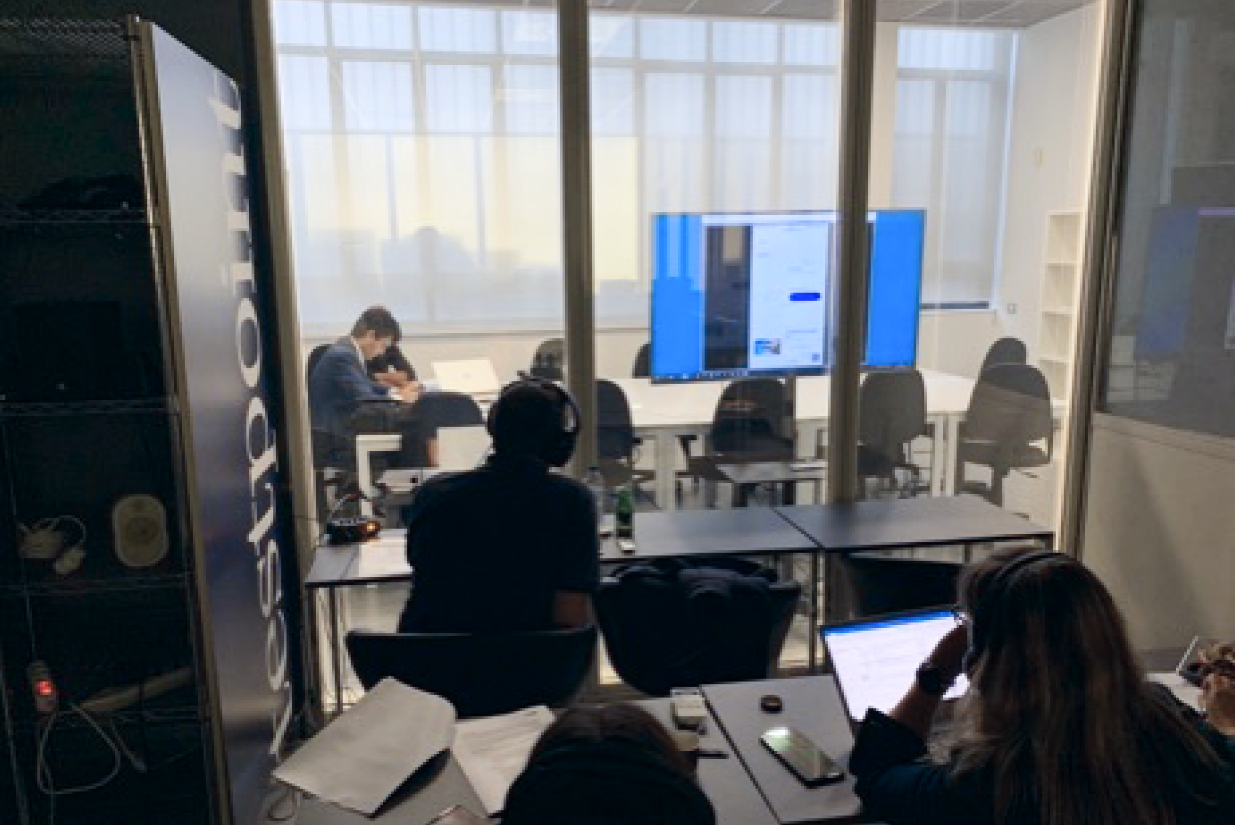
The evaluation consisted of 10 one-to-one sessions with users representative of Samsung’s target audience.
A Usability evaluation is conducted by having a representative sample of users attempt to perform tasks typical of those users would be attempting in the real world.
The tasks for the evaluation were designed following discussions with Samsung and an analysis of the Samsung.com/it website.
01
The Challenge
The goal
The goal of this project was to evaluate the usability of Samsung Italy’s Product Detail Pages (PDP) for products such as smartphones, TVs, and washing machines. The evaluation aimed to identify usability issues that could hinder users’ ability to make informed purchase decisions and complete the checkout process efficiently. Specific focus areas included:
- Assessing whether product detail pages provided sufficient information for purchase decisions.
- Understanding users’ post-purchase journey.
- Evaluating users’ recognition of added costs related to additional services.
The research
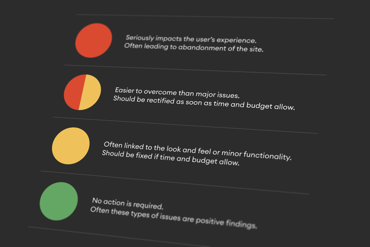
The research was conducted world-wide, with Italy being the last european country to be tested, in september 2019. The findings specifically include participant feedback, task success, errors and their severity ratings, along with actionable recommendations for improvements.
Participants
10 users representing Samsung’s target audience were recruited. They were selected based on criteria like age, familiarity with Samsung products, and likelihood of purchasing high-end smartphones, TVs, or washing machines within the next 3 months.
Profile
- Age range: 18 to 55 years old
- Tech-savvy (rated themselves 7+ on a 10-point scale)
- Familiar with online purchasing on both smartphone and desktop platforms
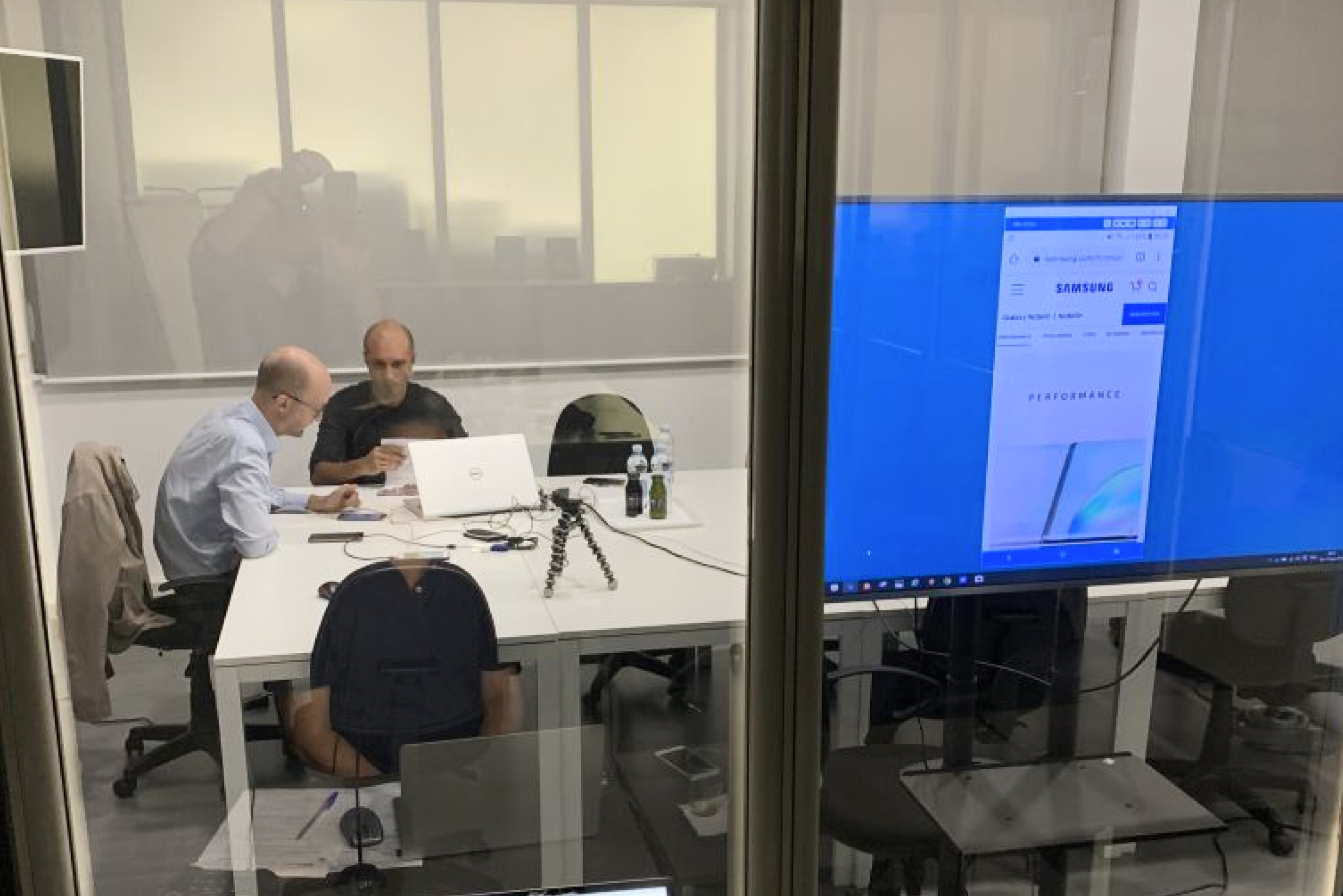
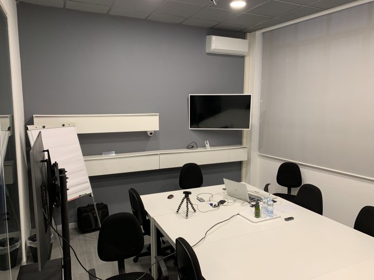
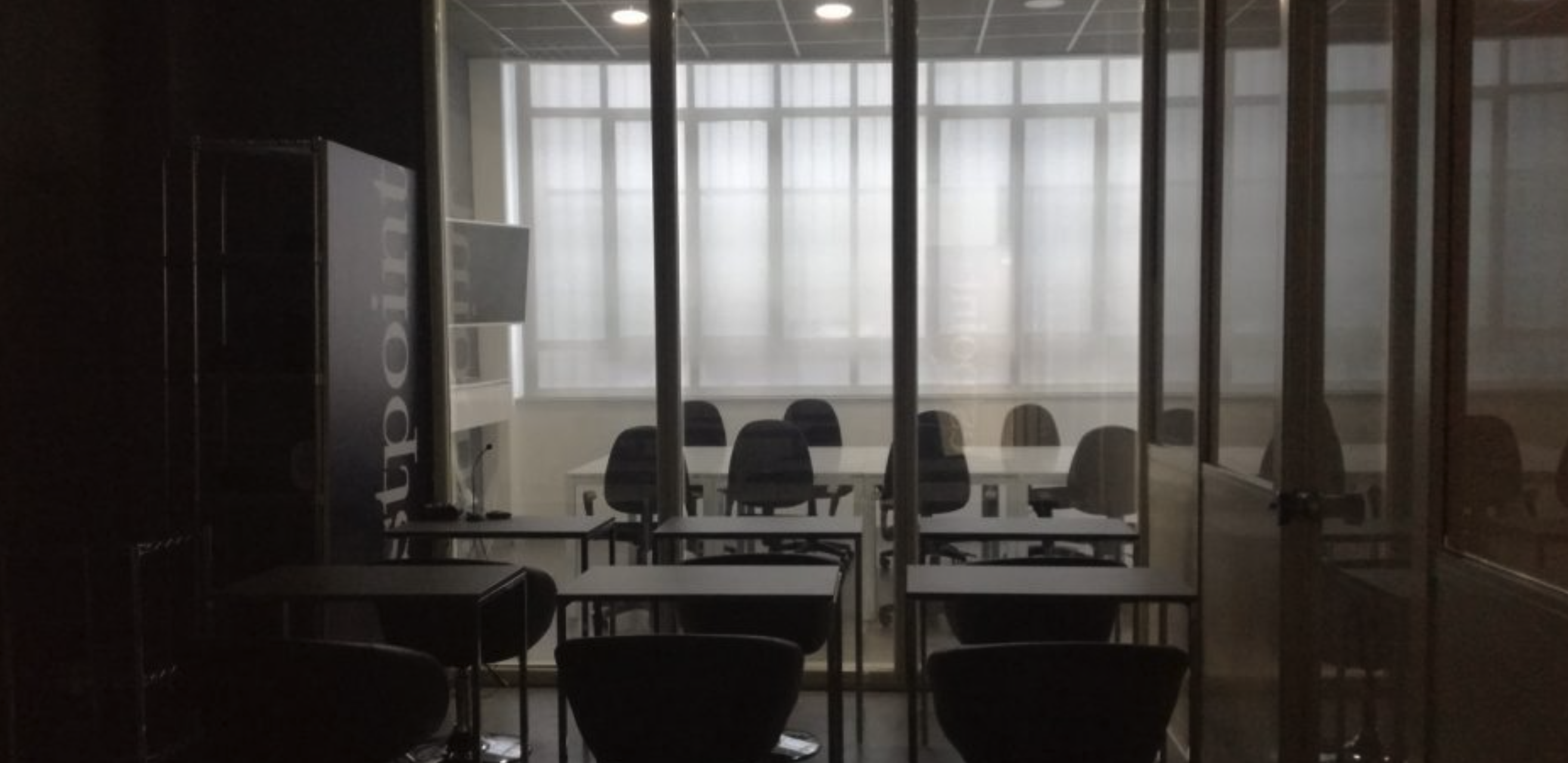
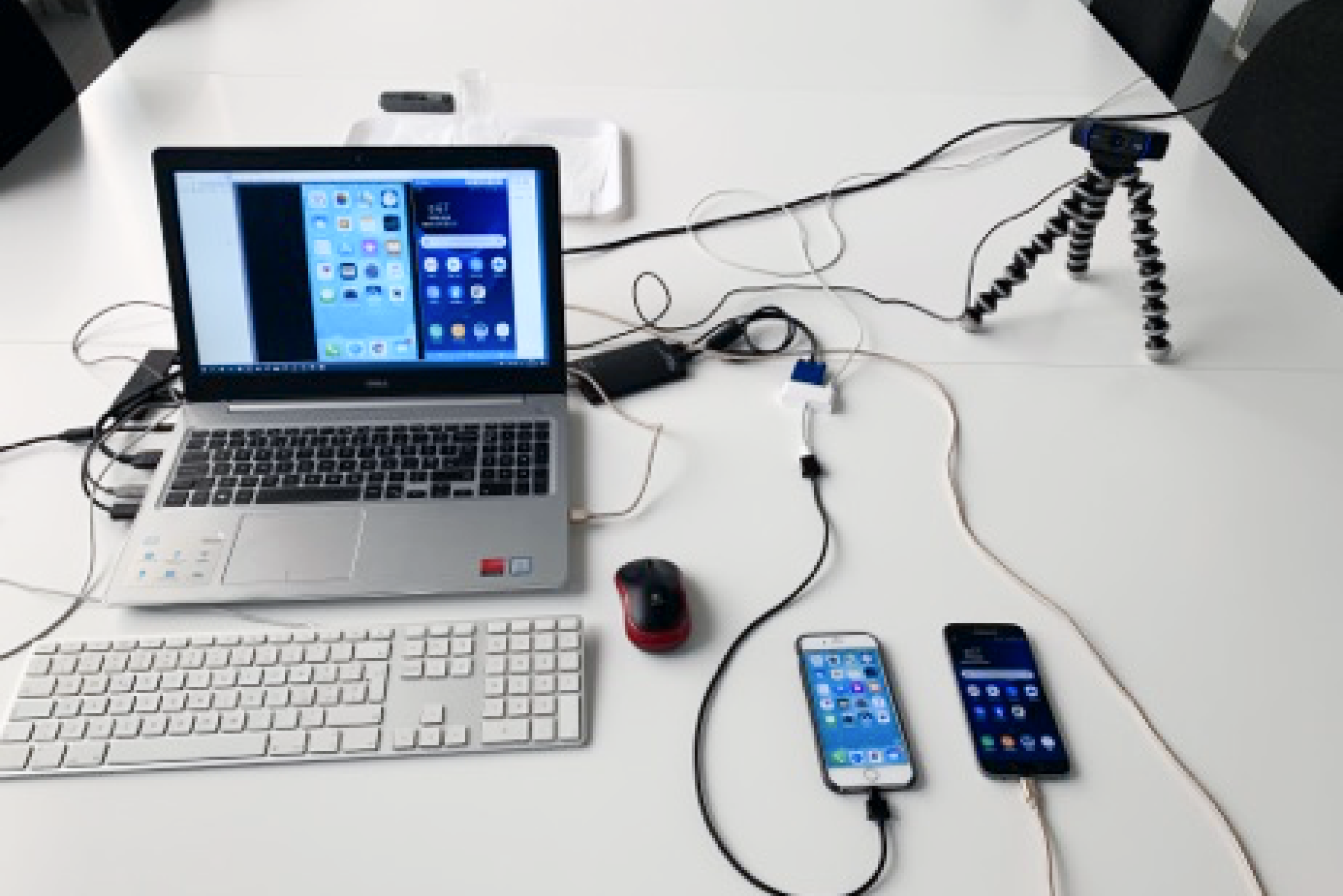
Setup
- Windows PC
- Samsung S7 (Android)
- iPhone 6S (iOS)
Metodology
During the session, I explained the usability session and asked the participant to complete a number of tasks, requiring interaction with the purchase process for each product area.
After the last task was completed, the participant was asked to rate different aspects of the site and offer overall feedback.
02
Some of the Key Findings
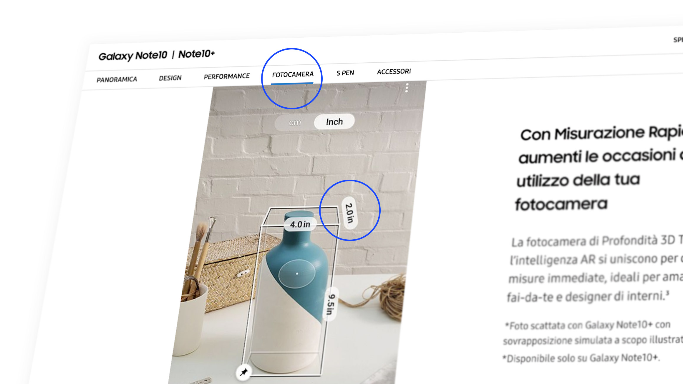
Complex informations
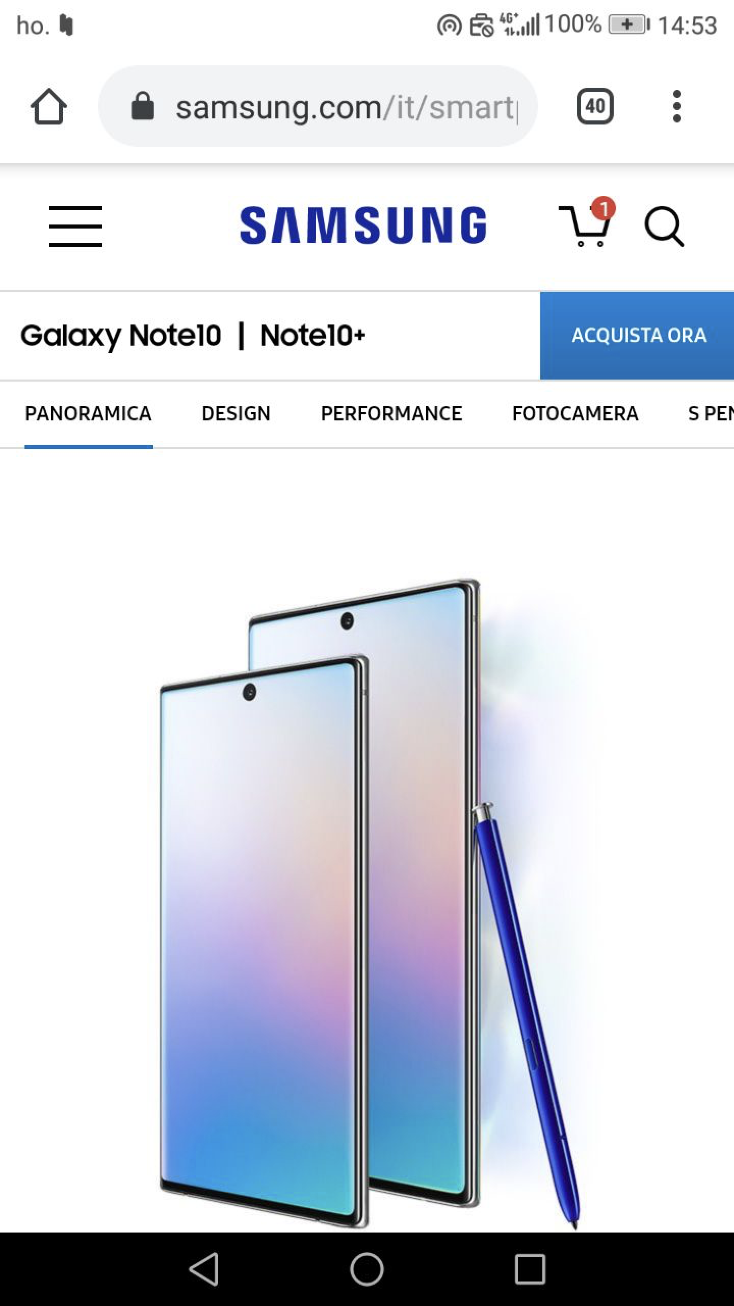
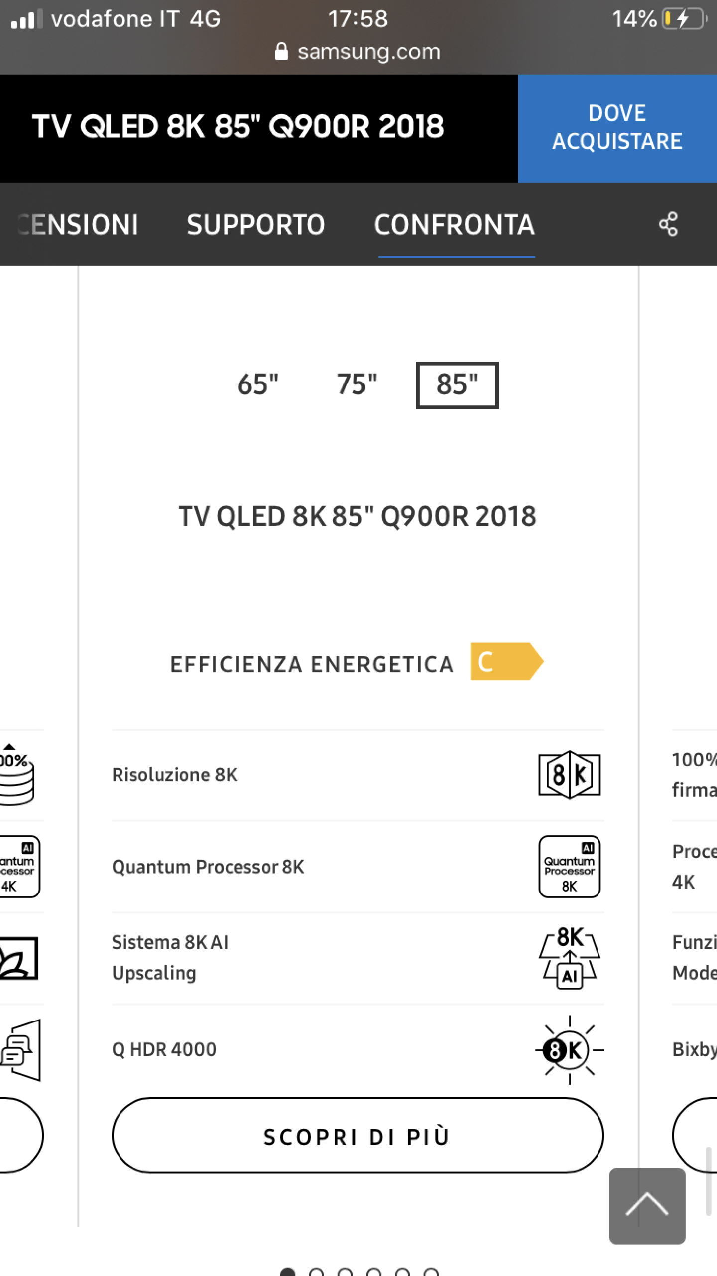
Finding: Product detail pages often contained too much technical information, which was overwhelming for average users. Many users left the site to seek external validation, such as advice from acquaintances or visits to physical stores.
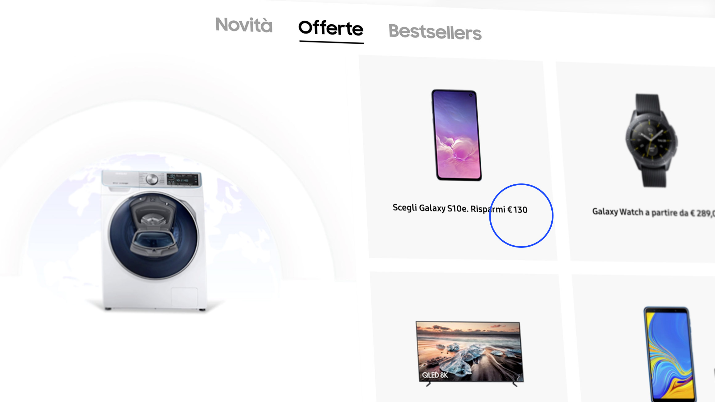
Price Visibility
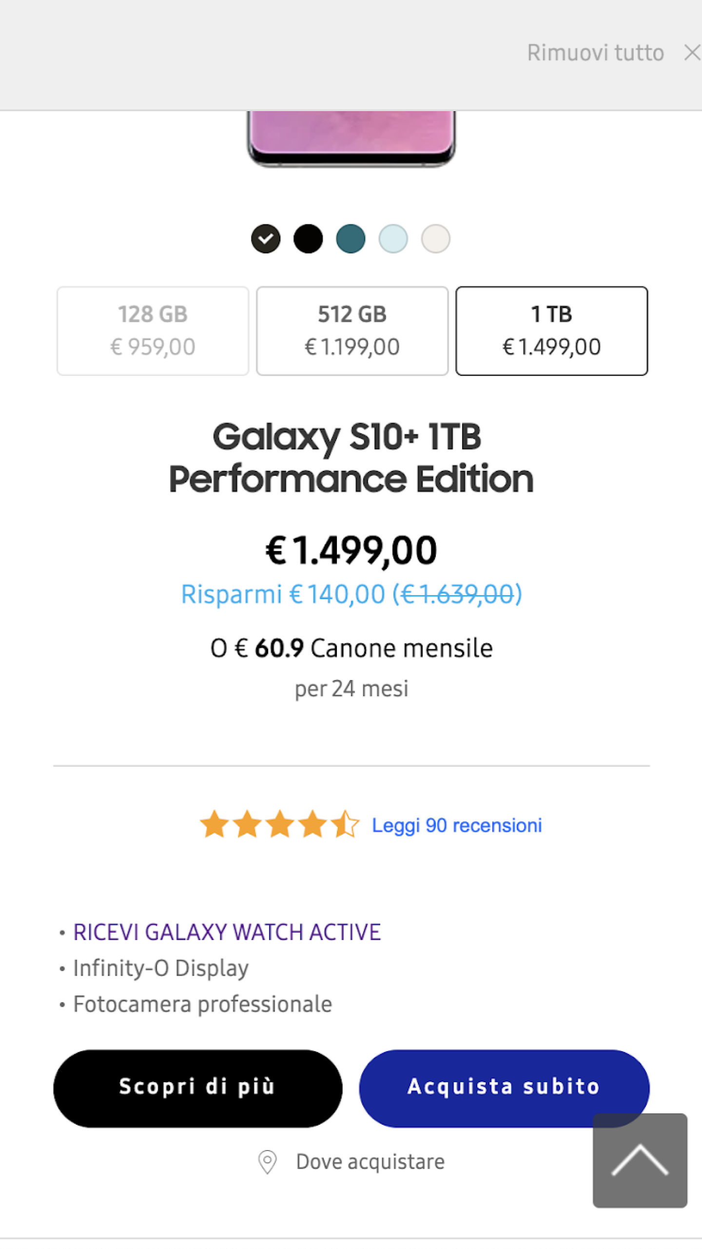
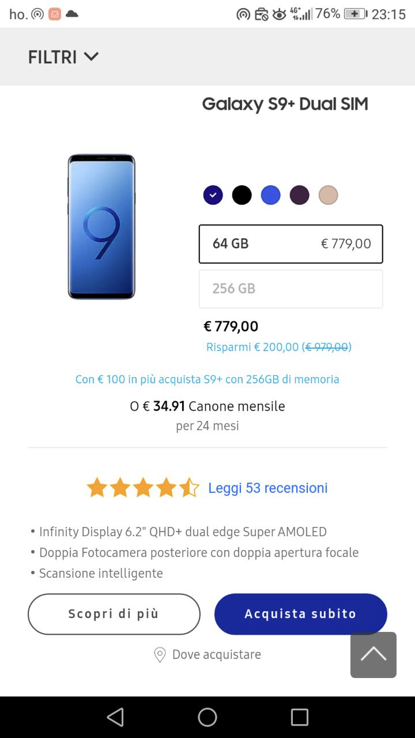
Finding: Prices were missing or unclear on some product pages, which confused users and made it difficult for them to proceed with their purchases. Price was identified as a key factor in users’ decision-making process.
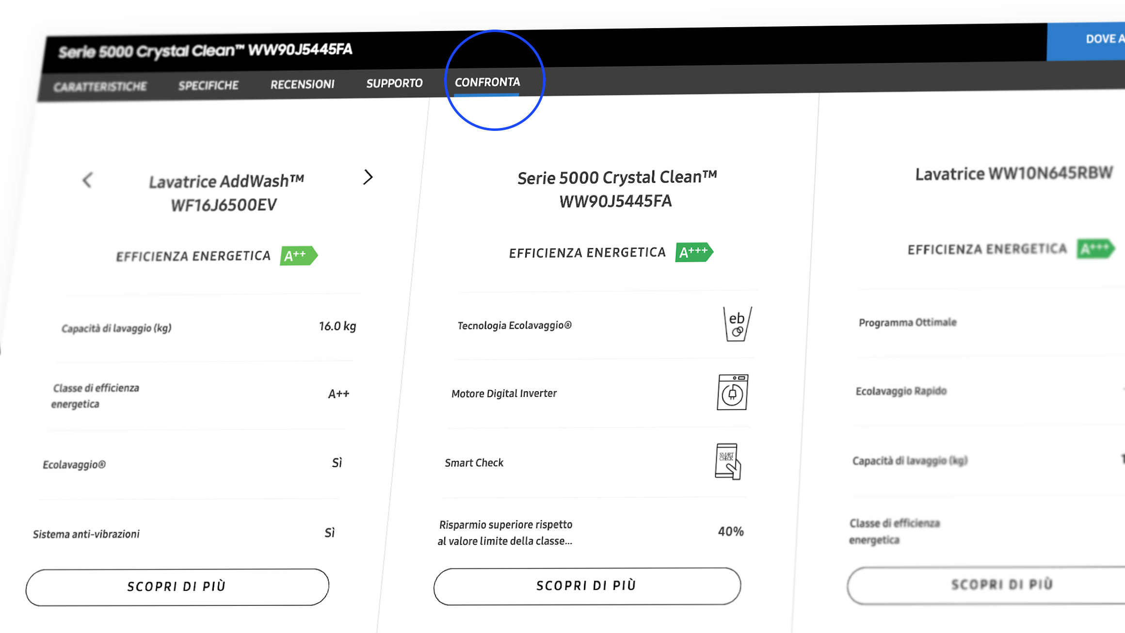
Compare Functionalities
Finding: The compare feature, although appreciated, was difficult to use due to hidden or unclear options. Users struggled to compare products effectively, especially on mobile devices.
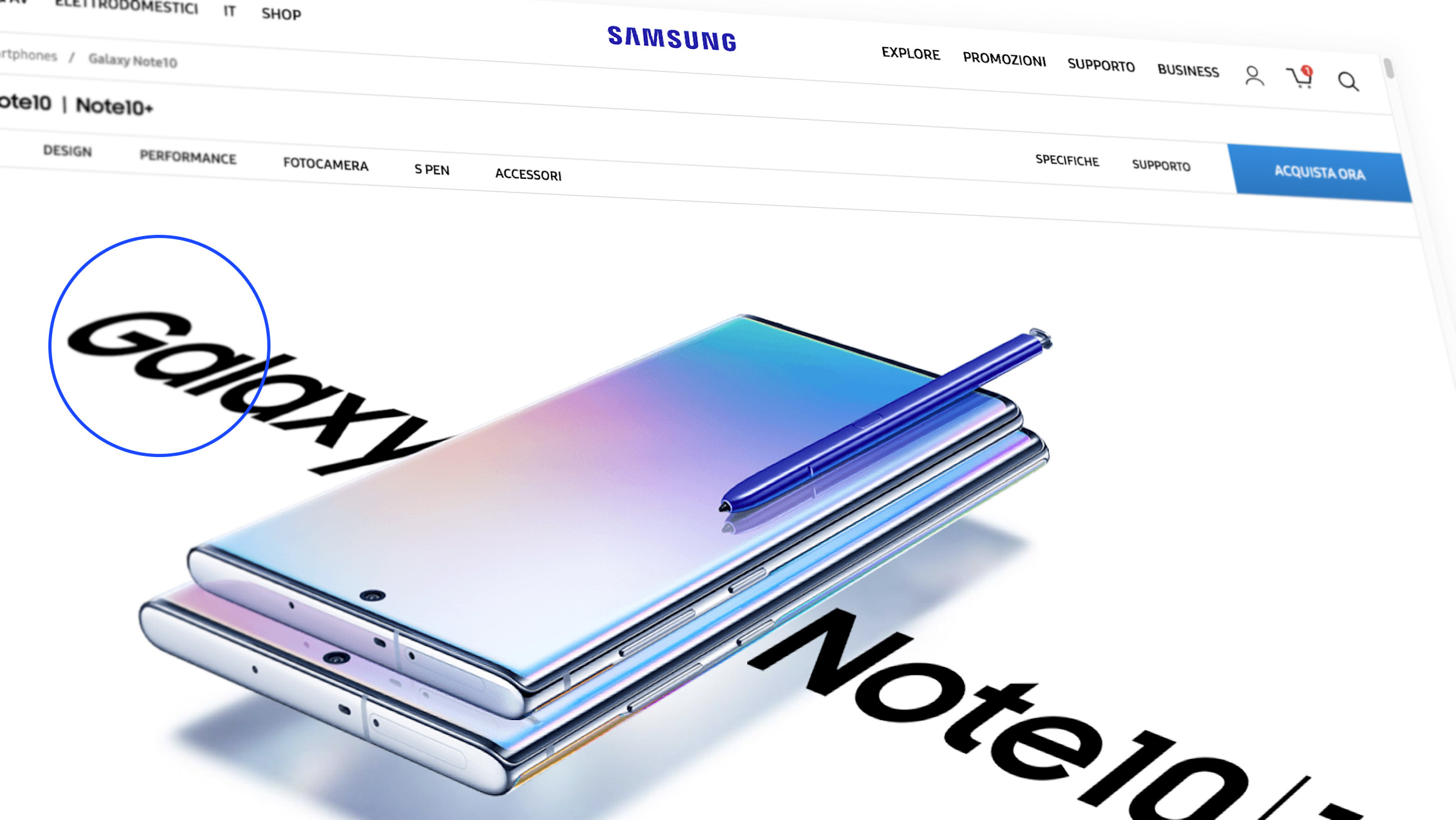
Brand trust
Finding: Despite the usability issues, Samsung as a brand was trusted. Users expressed high regard for the quality of its products and services, but they would often turn to third-party websites due to better prices.
Missing Product Information
Finding: Critical details such as product dimensions and energy efficiency were often missing or hard to find, especially for washing machines. This information is crucial for users when selecting products.
03
Takeaways
Findings report
The document summarizes the core usability issues discovered during user testing, including complex product information, navigation inconsistencies, lack of price visibility, and unclear checkout processes. Each finding is supported by user comments and real feedback from testing sessions, giving an accurate reflection of the user experience.
Recommended UX improvements
Based on the findings, we proposed specific actionable recommendations to address these issues, such as simplifying technical product details, standardizing page layouts, making pricing more prominent, and clarifying the checkout process. The goal is to create a smoother, more intuitive user journey from product discovery to purchase completion.

