Beema
Design System
01
This thing is a mess!
After 1 year of working for Beema, we started growing and scaling our product to new markets. The way the design files were structured was not sustainable anymore: there was not a real Design System in place, components, and icon lists were growing out of control, and design and development teams were starting to slowly grow apart.
I kicked off the process of creating a new Design System for Beema in 2021 and so far it has been quite a journey. Bringing devs on board, setting up routines, reorganizing taxonomy, simplifying our components, and basically keeping the System alive was just a small part of the huge work my team and I did in the past years.
THE STARTING POINT, IN A NUTSHELL
01
✋🤘🏻🖖🏼☝👇🏻
5 Designers, 5 developers and a long list of inconsistencies and misalignments between them.
02
📱 💻 🌍
A website, a blog, a mobile app, a dashboard, multiple funnels, 5 verticals, 2 languages.
03
🏗💥
A very messy set of layouts just migrated from Sketch to Figma
02
Step by step
Kick off
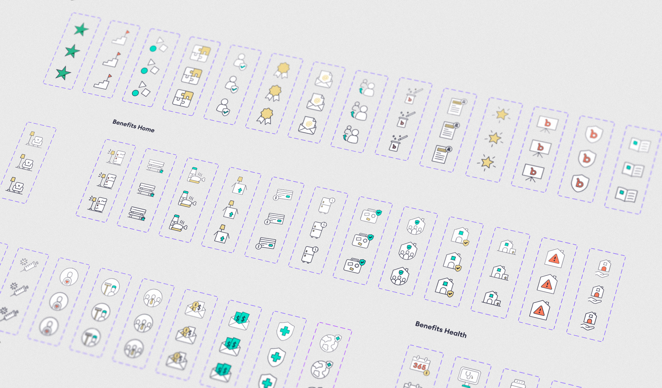
Once we started scaling, having a structured Design System had become a priority for the design team, but still, the devs had to deliver new features quickly and there was no time to focus on refactoring code. That?s why we kicked off the project with a quarterly approach: Every quarter the Design Team would focus on a portion of the Design System: Colors and fonts, Icons, Elements, Components, and Modules.
Spacing, Colors, Fonts
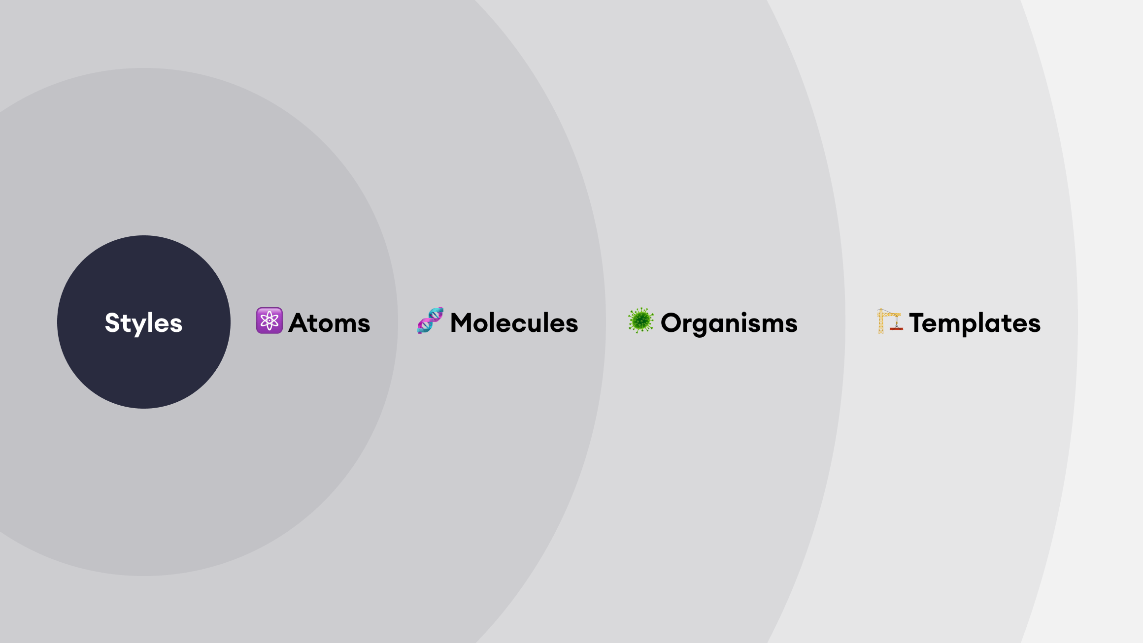
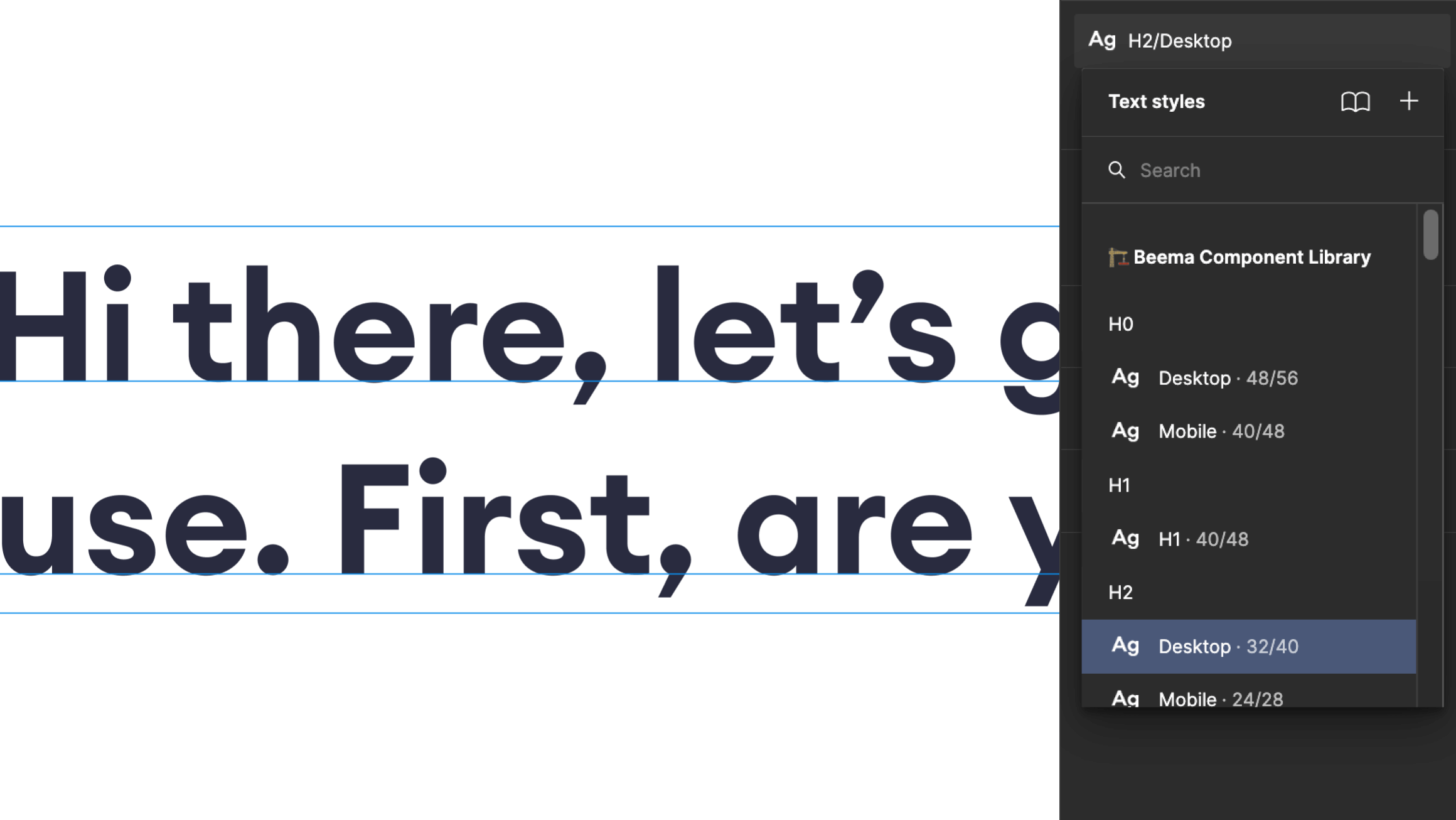
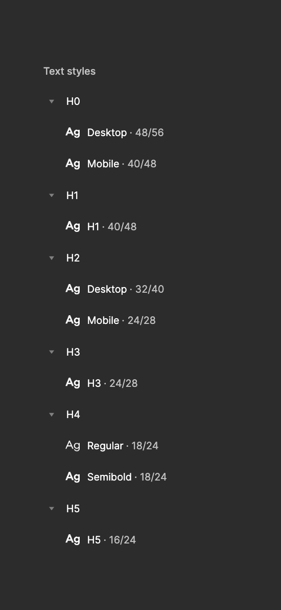
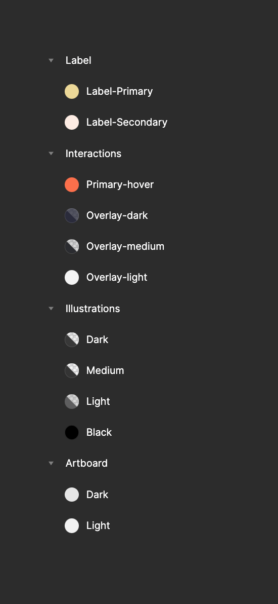
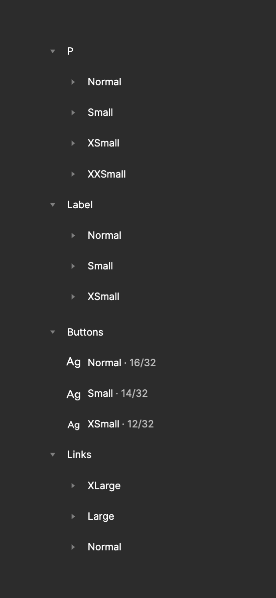
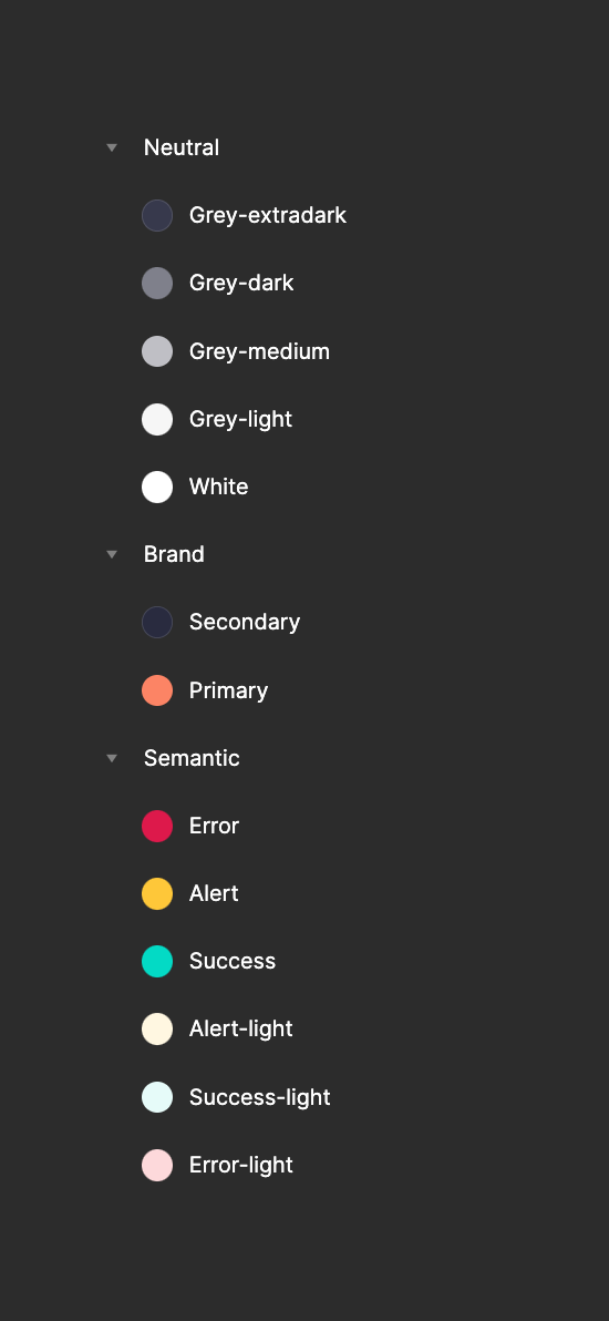
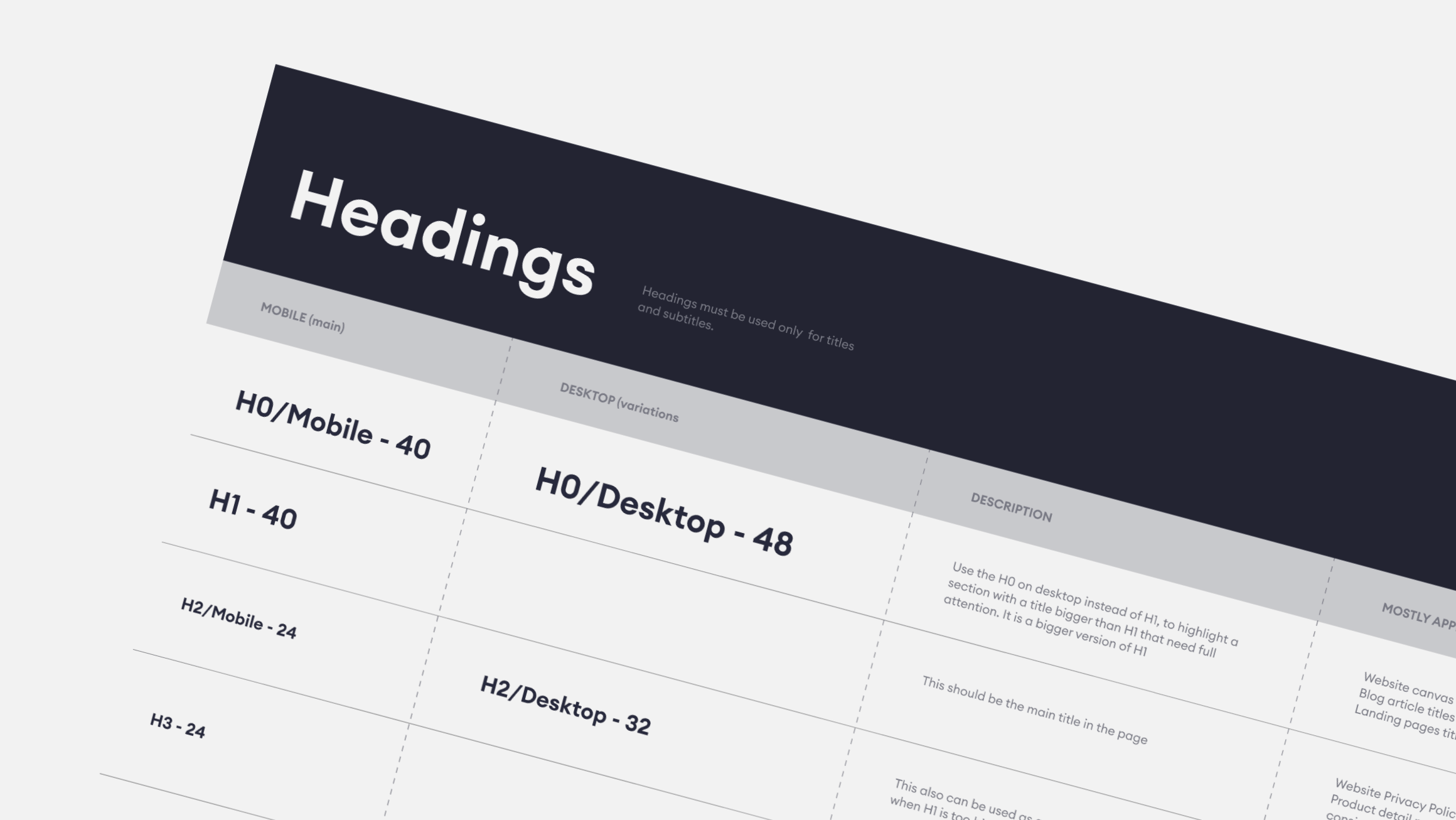
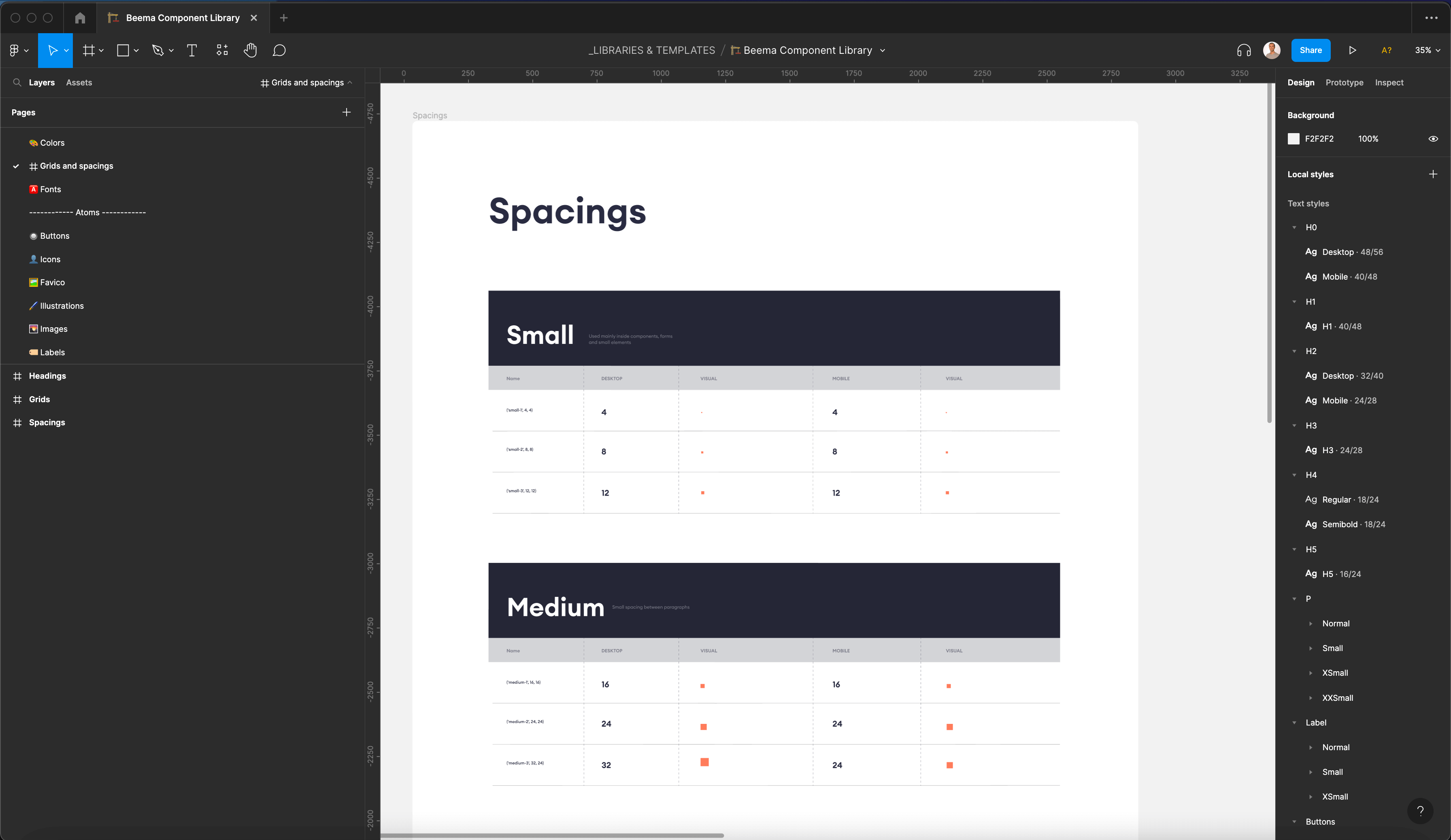
We started by reducing and renaming the color palette. Then we analyzed all the font styles used and tried to simplify them to minimize the styles. Finally, spacing, margins and padding were updated everywhere with our new base 8 spacing scale
Icon Taxonomy
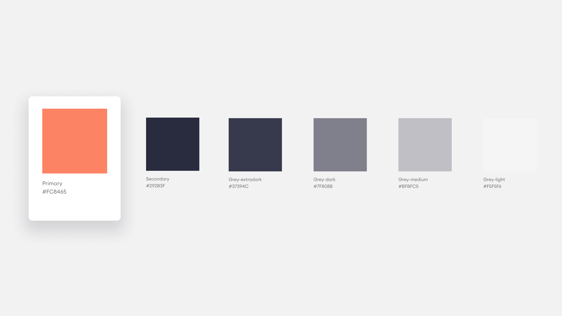
We moved from a non-organized icon set with different styles, different outlines, and many duplications to a well-structured taxonomy. We removed duplications and named icons by representation, not by use. We added tags to help designers browse for icons while designing.
Illustrations
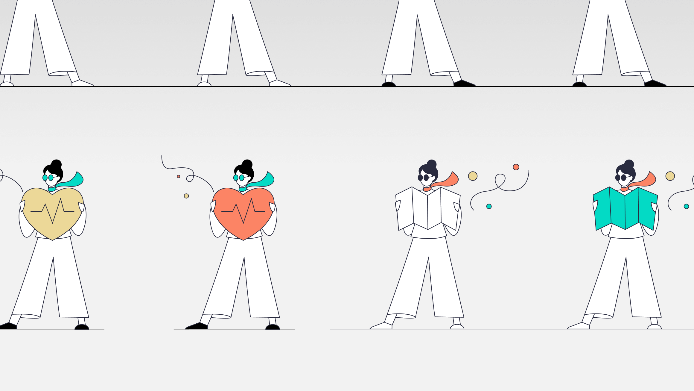
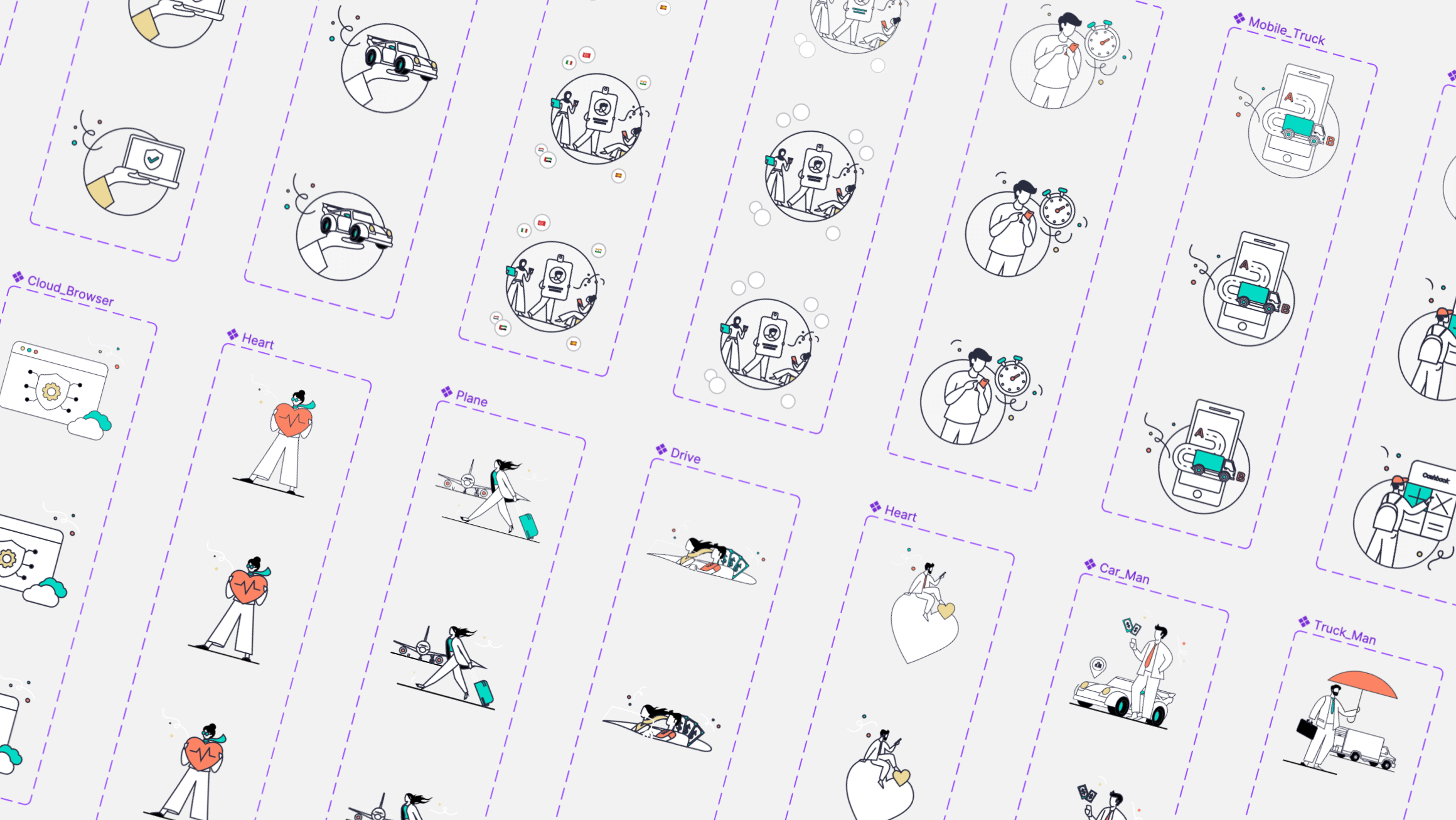
Illustrations, previously kept in Illustrator, were integrated into the Design System and ordered by size.
Components
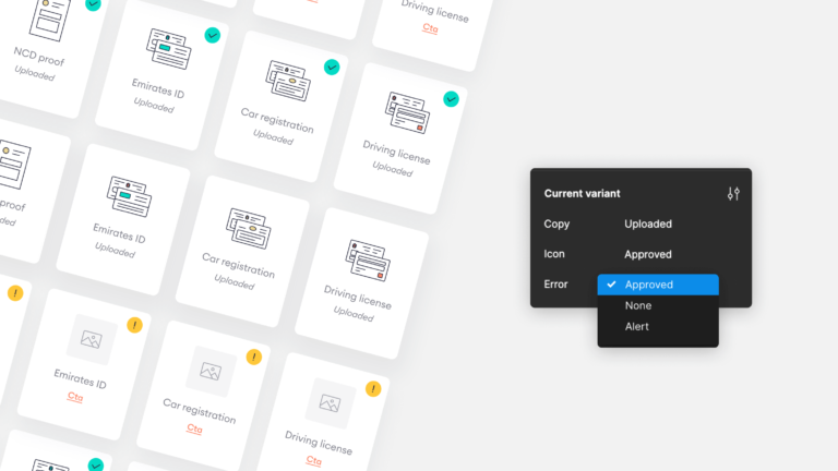
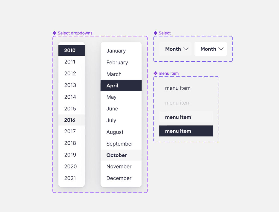
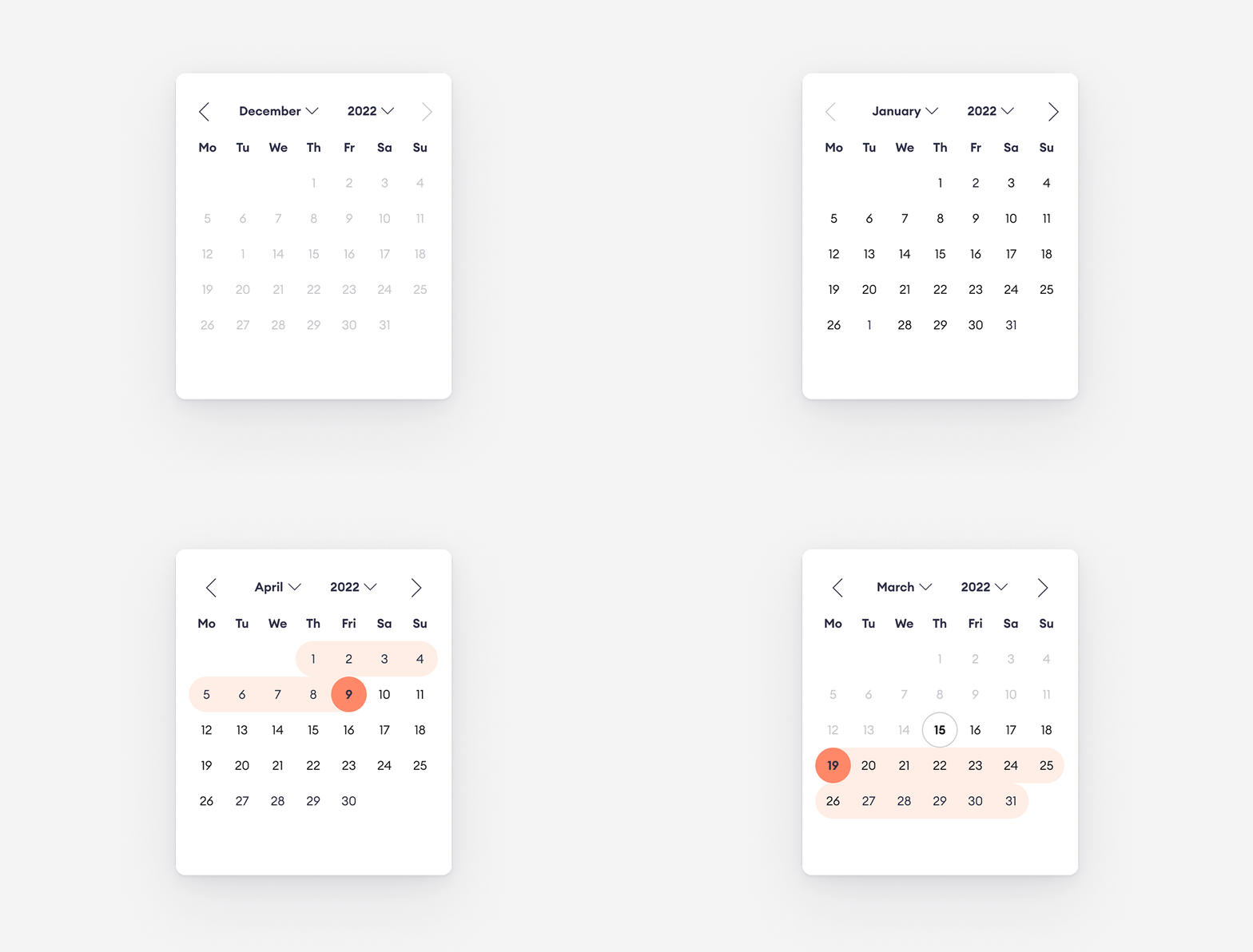
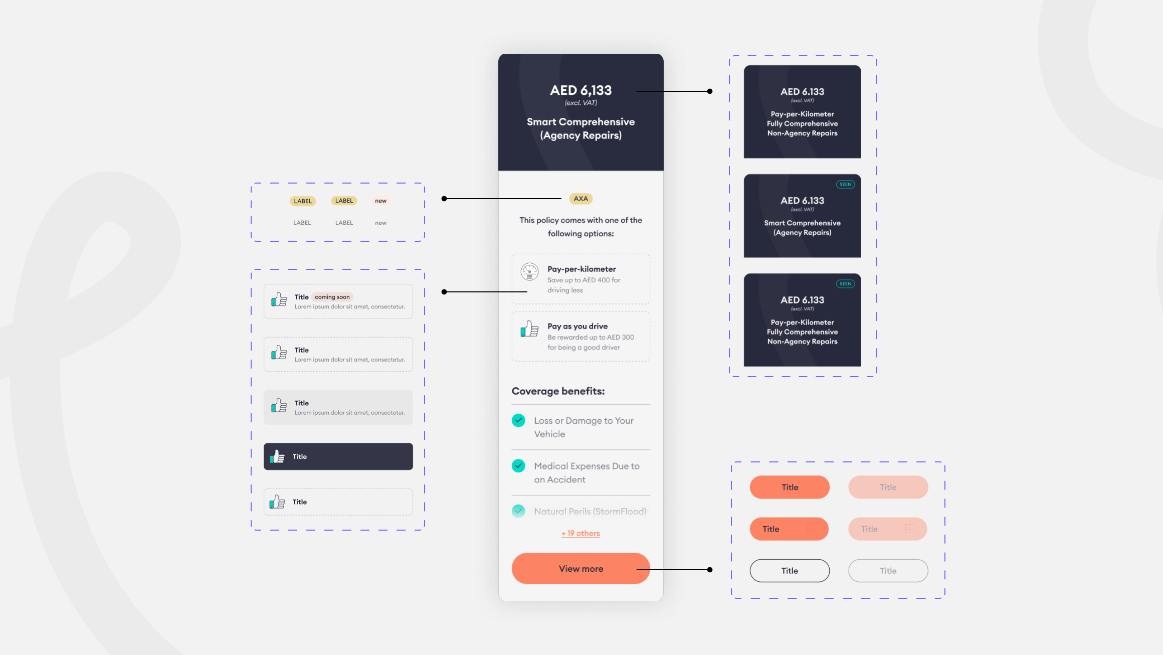
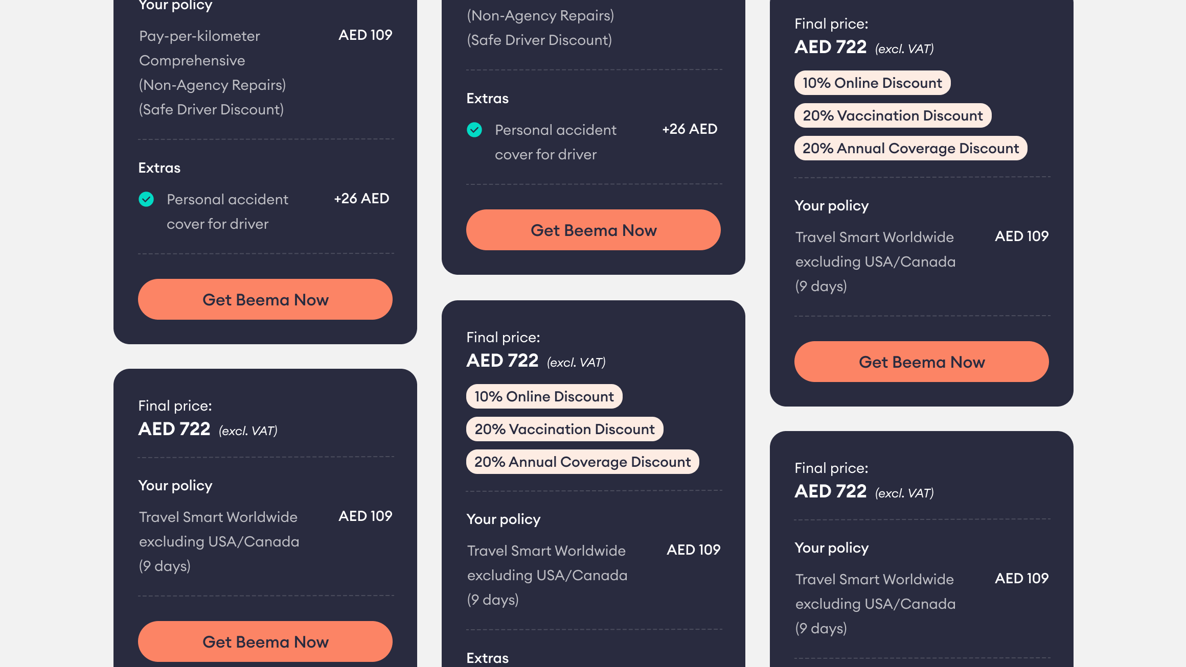
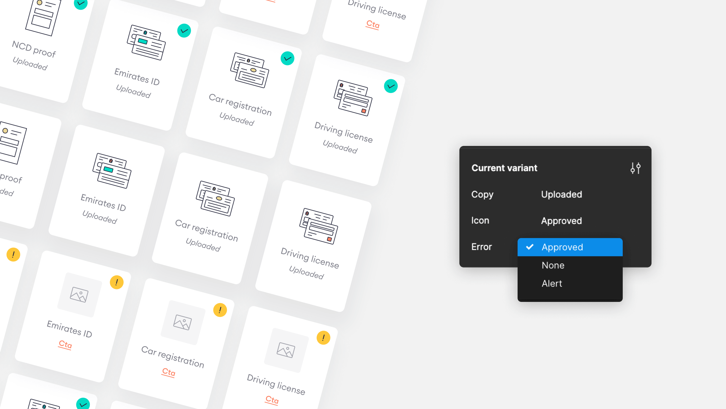
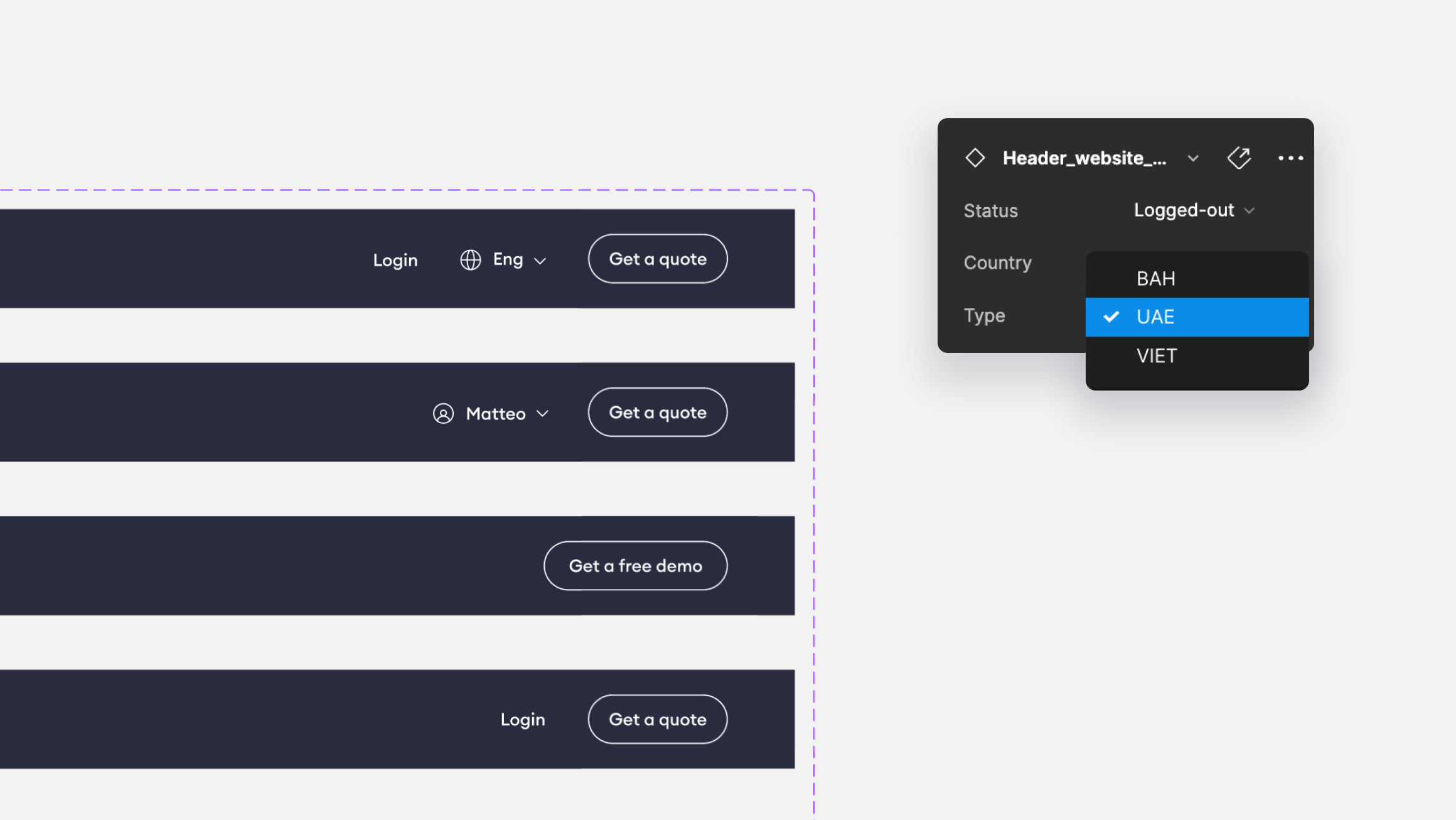
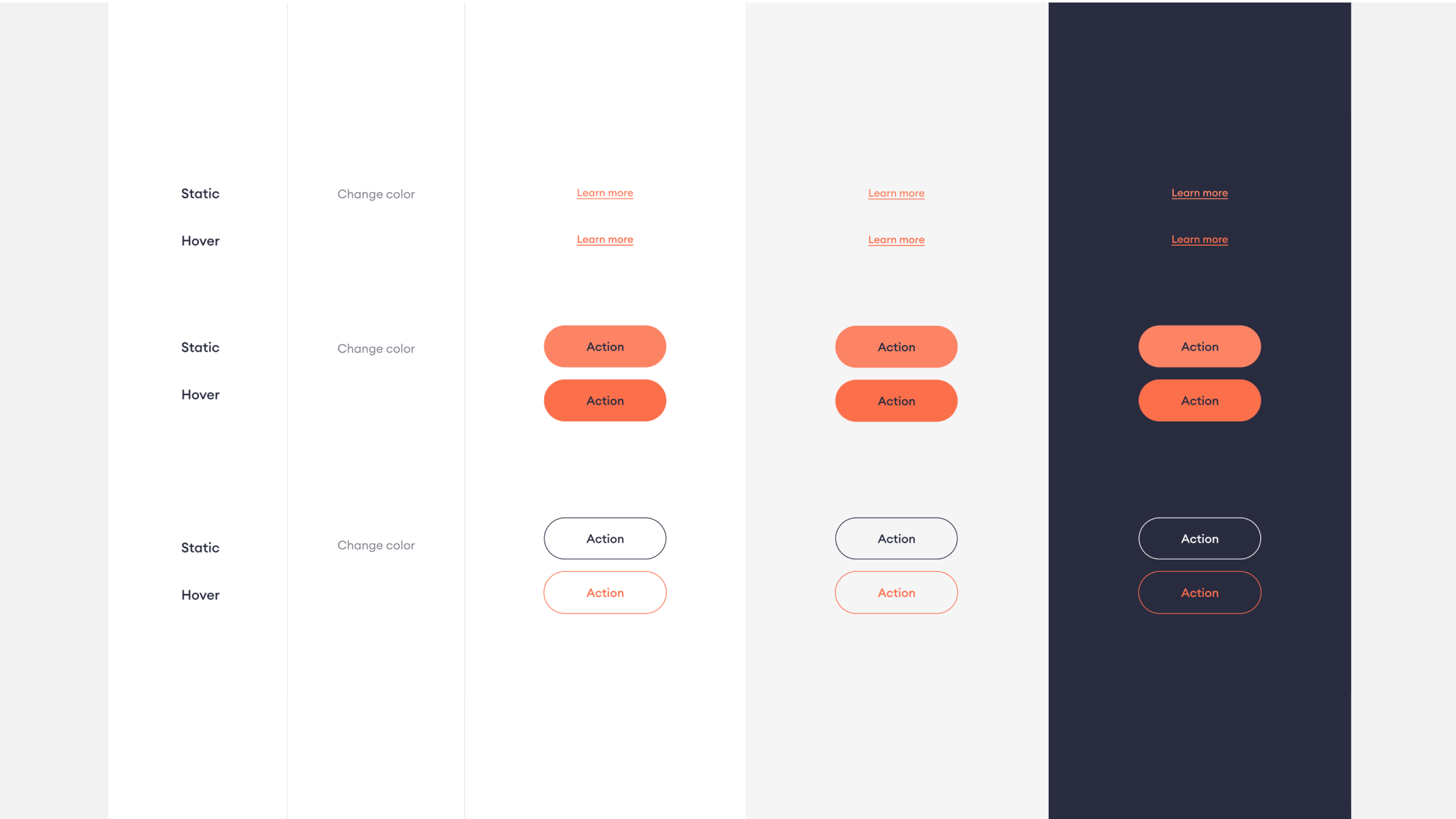
Components were divided into Elements, Components, and Modules. With Figma variants, we simplified the component base and we made every component scalable.
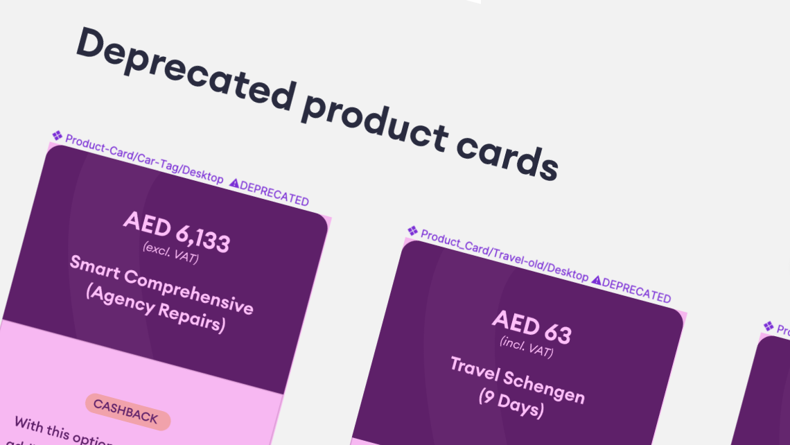
Deprecated components
We marked the deprecated components to highlight them in the designs, and little by little we archived them or updated them during our weekly catch-up.
One language
We aligned with Devs and named spacing, fonts, and components in the same way. That was a fundamental step to start speeding up the delivery process.
Routines
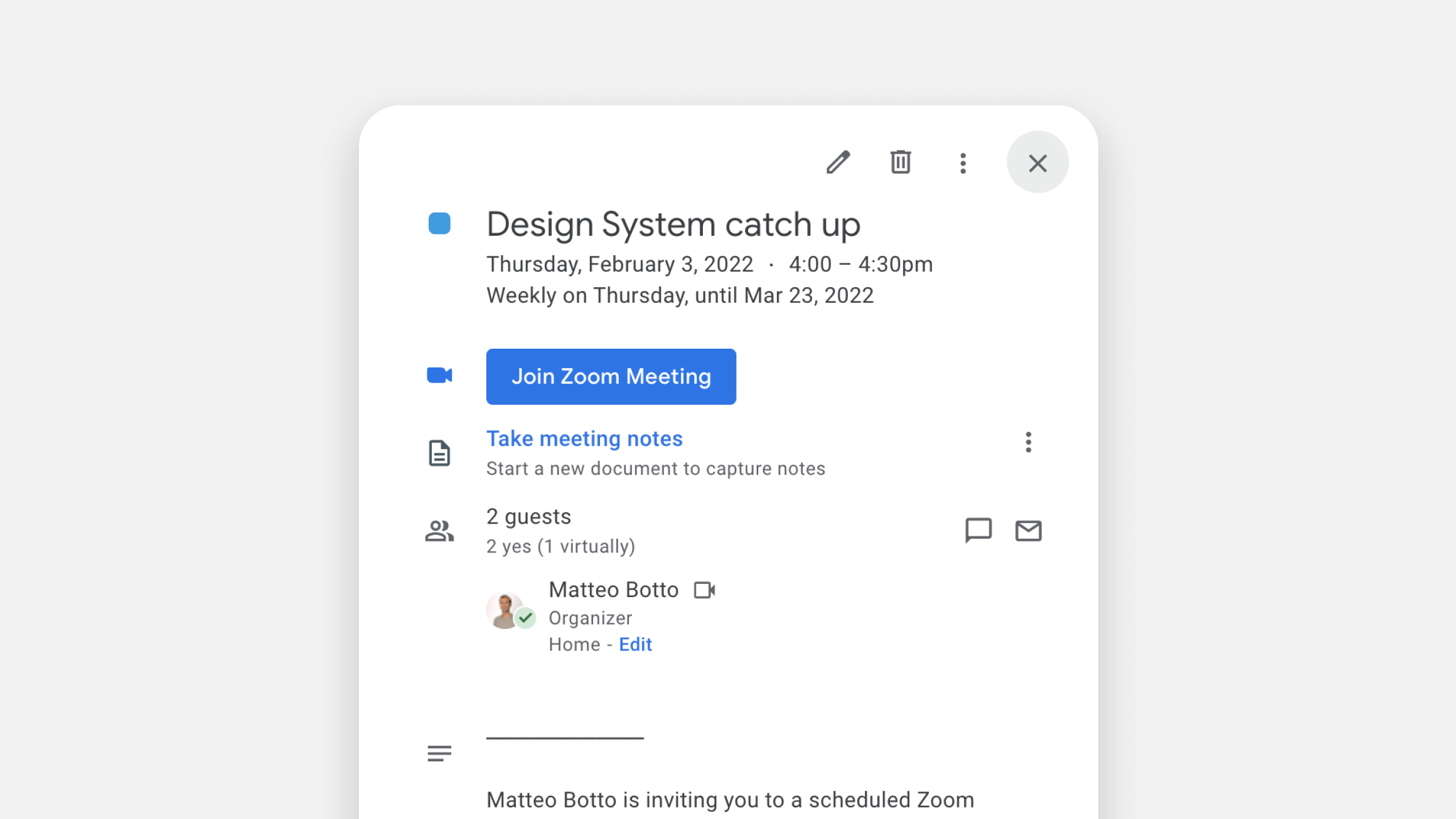
To keep the Design System alive, we decided to set up a series of routines to keep it always up to date. Every week the design team would have a ?Design Clean Up? meeting to update components, remove deprecated ones and clean up files.
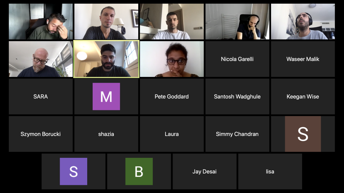
Once a month designers and dev would have a Design System meeting, to align on components changes and plan next month’s updates.

03
What did I learn
Results
- Design speed increased massively
- Less component duplication
- Better communication between designers and developers
- Delivery of new product became faster by 2 months!
Takeaways
- You need to clean up your shit every day
- Having a design System is like having a pet: you need to take care of it, or it will die
- Devs and Designer have to speak the same language?
- Design System is often not a priority for startups: tackle it little by little, try to not put too much pressure at once on the delivery team<


